This week I was talking with a friend about colors. He works with computers, and he described the way he color-codes the backgrounds of different terminals so he always knows where he is. The green ones are his “home,” where he feels free and safe, like he’s returned to where he belongs.
I have been thinking about this a lot since then, the meanings that colors carry, and especially this sense of belonging and feeling at home. Not surprisingly, it worked its way into my painting.
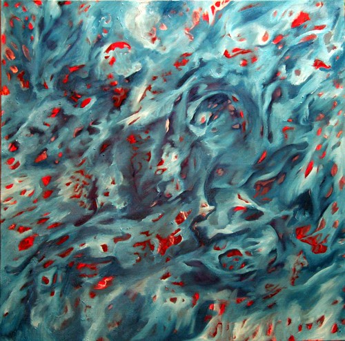
24"x24" oil on canvas, in progress
I had started then abandoned this canvas almost two years ago. It’s always carried a nice energy for me, so I enjoy starting it up again.
Something I’m finding interesting about the way the colors are working now is the tendency for blues to recede and reds to come forward. It’s a kind of push/pull which I’m playing against with illusionistic shading in the blue areas.
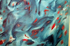
detail view
There is a murky grayish purple color behind the transparent phthalo turquoise that keeps sneaking into it. I’m not sure it bothers me, but I’m very aware of it.
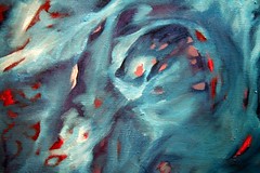
detail view
The movements are pretty satisfying, though the scale is perhaps a bit tight in places.

detail view
I’m looking forward to working on this piece more. It has a lot of really comfortable feelings and associations in it. I realize that a lot of my process involves the people I am thinking about and the music I am listening to while I paint. This one has some great stuff in both respects.
One thought on “The colors where we’re home”