Pocket Sea, 2017, 4″x4″x7/8″, oil on cradled board
I’m delighted this tiny painting will be included in Spectrum Gestalt 5, an exhibition of works of predominantly one color, installed in an expansive spectrum.
“No one could write truthfully about the sea and leave out the poetry.” – Rachel Carson
Inspired by a childhood spent steps from the Atlantic Ocean and surrounded by rivers and moving bodies of water, this painting reflects a deep-seated, primordial, and essential love of the sea. Regarding the surface of the ocean as an evocative parallel for the mystery of consciousness and all that being human entails, “Pocket Sea” is a glimpse of the vast infinities we all carry within us.
The image flows over all edges for a continuous expanse of water and contemplation.
If you are in the Santa Monica area, I hope you’ll pop into the blue section to check it out in person. It looks to be a wonderful show!
Spectrum Gestalt 5
June 16-July 8, 2018
Opening Reception Saturday, June 16, 5-9 pm
Closing Reception Sunday, July 8, 2-4 pm
Gestalt Project Space / bG Gallery
3009 Ocean Park Boulevard
Santa Monica, CA 90405 (map)
In the last few hours before I officially open my shop for business, I wanted to take a deep breath and remember a moment almost a year ago in a village in India. I’ve written a bit on my personal blog about what a life-changing experience my trip was, but this sweltering afternoon in Alipura was really the moment it happened.
It was so hot outside that our group leader suggested we postpone our scheduled walk so everyone could hydrate and cool off in their air conditioned rooms until the temperature came below 100°. I couldn’t stand to be indoors, so I walked very slowly, liter of water, sketchbook, and camera in my bag, up the main road of the village, just seeing and being. I stood beside a cream-colored cow, letting my gaze wander across the alley to the two-level house in the photo above. It was painted an unusual green-tinged blue, unlike the indigo-based paints used to repel insects, and I saw Hindi writing that had faded, probably from the last wedding celebration. The slightest breeze stirred a tree branch overhead, moving its shadow away from a startling patch of emerald green that simultaneously made no sense and perfect sense, color-wise.
I took my time pondering how this building came to be colored in the way it was. Was this patch of green typically in shadow and fading unevenly from the adjacent area? Was it a newly-painted repair? Would it fade too, or would the rest of the house turn the palest cool white while this spot remained richly green?
I wanted to keep the light and colors of that green next to that blue, as it suddenly had become the most precious and important passage of color in my life. I stood with my camera ready, waiting for another gentle breeze and the few seconds I would have to make sure I’d captured the color the way I saw it.
I sighed and thought the typical office-worker’s lament to myself, “Oh, I wish I could do this all the time…”
In that instant, simultaneously the breeze nudged the tree, the sun came out brilliantly from behind a lazy cloud, the green seemed to radiate from within, I released my shutter, and something like a jolt of electricity went through my entire body, a booming voice saying, “You can. And you must.”
I’ve read about religious and spiritual callings that take a similar form, where a disembodied thought feels for all the world like the earth splitting open and reverberating with the voice of God giving explicitly clear instructions to guide one’s life. It was like the instant of falling in love or jumping off a cliff, equally terrifying and exhilarating, trembling and my whole body breaking out in chills. Everything in my mind switched instantaneously to a certainty of purpose I’ve never felt before in my life. The wind was knocked out of me, and as all the sound and colors came rushing back at once, I felt like I was going to faint, or possibly explode. I wondered for a second if I was having a heat stroke or if a bull had decided to exact revenge at precisely that moment for my history of cheeseburger-eating and had just gored my chest. But everything was coming back more clearly and vividly even than I’d known it before, including the understanding that this was something real, coming from something much bigger than myself.
A line was drawn in my life from that moment forward, where I knew, really in the depths of my heart knew, what I was put on earth to do. I am an artist, I have been all my life, and I have literally been commanded by the universe to be an artist all the time now.
As my life started completely transforming after India, a lot of things came together just so to give me the opportunity to spend the past few months rediscovering who I am as a person and an artist, and to change my days to doing that – being an artist – all the time. I am so profoundly grateful for the encouragement, problem-solving, and inspiration of the people in my life who have helped me get to what now feels like the precipice of actually doing what I’ve been meaning to do my whole life. It is no exaggeration to say I feel like there was a moment of divine intervention or personal epiphany or whatever you’d like to call it that saved my life in the instant my camera recorded this silly little multi-colored house.
I’ve faced more than a few setbacks and frustrations along the way (I’m going a little nuts about how many things I want to change already in my shop and on my site) but I want to remind myself that this isn’t something I chose. It chose me before I could speak or walk properly, when I dragged my fingers through sand at the beach and realized I could take what I experienced inside my mind and soul and share it with other people. I’ve remembered how a back-lit leaf or sunlight shimmering through new blades of grass reveal all the mysteries and wonders of the universe in an effortless instant. Art has been the greatest gift of my life, and turning back to it after neglecting it for so long feels utterly and completely like coming home.
I am incredibly excited for the challenges ahead, for giving this business my truly best effort, and for doing whatever it takes in my life to be able to keep making art and being an artist, all the time.
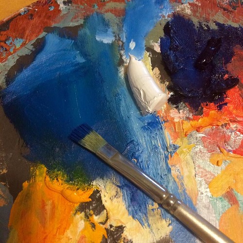
I’m currently working on a painting that’s mostly blue with traces of green and white. When I set my palette down to get a drink yesterday, I fancied the way it looked, snapped the photo below, and posted it to Instagram without much thought.
As the afternoon went by, my phone occasionally blinked with notifications for favorites or new followers, and later I realized that #palette is a pretty delightful rabbit hole on Instagram, mostly to do with cosmetics. I browsed through other artists’ palettes, reflecting on process and studio habits with a nearly voyeuristic curiosity.
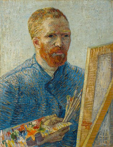
I think palettes are a bit like handwriting. Everyone learns similar ways to organize and handle their paints in art classes, but over time we develop idiosyncrasies and preferences that are deeply personal and, I think, reflect the way the hand works. Art historical publications and exhibitions are starting to include palettes like van Gogh’s, which gives tremendous insight and sometimes revelations into materials and techniques. Recognizing artists’ preferred pigments is invaluable in art conservation research, but palettes also give hints about the way artists regarded paint and their craft.
Vincent van Gogh, Self Portrait c. 1887-8
As I scrolled through Instagram, I found myself repulsed by some sloppy, muddy palettes (are they just trying to get rid of all their paint quickly??) and charmed by almost fetishistically beautiful palettes (no comment on how that may or may not relate to the actual finished artwork produced). As you can learn a lot from someone’s handwriting, I found I was often able to predict what style of paintings would be produced from various palettes.
So I looked back at mine and thought about my way of working. I tend to use only a few colors at a time, and I work almost exclusively wet-on-wet on the canvas. I go for pure pigments and am fascinated by their individual properties, so this current painting is being made primarily with a red-toned blue, cadmium yellow, and titanium white. If I were going to add another color (which I thought of doing with a phthalo turquoise and reconsidered), I’d have to consciously open it and add it to my palette, rather than dip into something that was already available.
I’m not sure if it is a reflection of my deliberate nature, or if I’m so used to being economical that I loathe the idea of wasting paint, even leaving very little on my palette by the time I finish a painting. One of my professors in undergrad suggested that if a painting starts to feel static, you can try working an unexpected color around a few places to see what happens, dab some spots of bright orange or pink on a blue-gray composition and see how you respond. I liked the idea, and for a while I would throw every color on my palette at paintings until they became big colorful messes with muddy colors. I was frustrated that forms were flattened into bodies of color and the attempts I made at drawing within the painting were reduced to color relationships instead of modeling. When I learned more about the different transparencies and opacities of various pigments, I started to simplify and more tightly control my palette, but my tendency to make basically monochromatic paintings lately suggests I may have overcorrected in my attempts at clarifying.
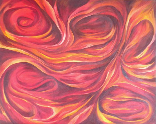
I have a few canvases in progress that have more complex color relationships going, and I think I’d like to challenge myself with a more robust palette when I get back to those. I don’t imagine I’m ever going to be inclined to squeeze thirty tubes of paint out to make a painting of a rose, but I do love color, so I’m curious to see how it goes.
One of the biggest downsides of the amount of time I’ve spent in school is that it’s left a paucity of energy and inclination toward painting. I am no longer in school now (it’s complicated) and I am working full time, and it’s wonderful. While I’m still exhausted and have little free time (I’m sure I’ll adjust), I have a much greater motivation toward my studio now that my free time is actually free and not stolen from something else I should be doing.
I’ve had this painting hanging out on my easel for an embarrassingly long time. I started it in a fit of energy back in February 2011, when the release of the new Radiohead album “The King of Limbs” prompted a renewed obsession with all things Radiohead, including “Hail to the Thief.” Increasingly, a lot of my art is a big love affair with music, and I remember distinctly that this painting started when I was obsessing over the song “Where I End and You Begin.”
(Ace video by Juan Pablo Etcheverry – direct link.)
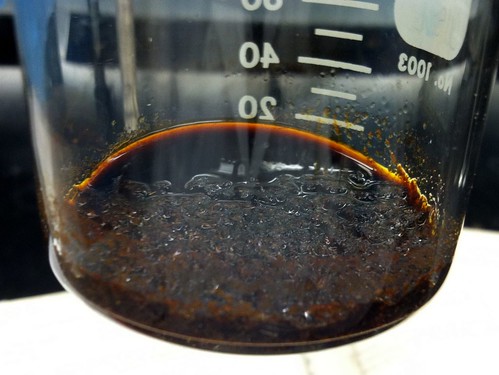
I was going for something complex and writhing, a seething, teeming entanglement of inside and out, other and self becoming one, resonating with those tight drums and extraordinary bass line. Later, I was also thinking about a particularly fascinating reaction in organic chemistry (the nucleophilic aromatic substitution on 2,4-dinitrobromobenzene with hydrazine in ethanol), where the volatility and reactivity of the compounds we used led to uncontrollable side-chain reactions. Our lovely transparent yellow and orange reactants, initially iridescent purple when mixed, became tar-like conglomerates of nitrogen-clumped impurities.
It was such a fitting metaphor for intense interpersonal relationships that become messy and destructive: two entities that are too much alike, too violently reactive, too susceptible to cataclysmic interference from uncontrollable forces; both turn from something pure and inherently open – even luminous – to a singular existence inextricably bonded in toxicity, so dense and dark that no light gets in.
Trying to push toward that exact reaction, I wanted this painting to be highly-contrasting orange and purples. I abandoned it when I over-mixed it all toward a fittingly muddy cadmium red-orange-brown, and its fate was sealed when I noticed the compositional and color similarity to a painting I did years ago.
I’m not done with this idea, though, nor even this painting. The opening lyrics of the Radiohead song speak to the opposite, to not being able to connect and feeling fundamentally separated:
There’s a gap in between,
There’s a gap where we meet,
Where I end and you begin
At first, I interpreted it as dealing with death, literally ending and not being able to connect with someone living. There was more to it, though, an ominous story that hinted at a complicated past and the severing of something that was once intensely linked. The obsessive tone and repetition of the closing lyrics (I will eat you alive / There’ll be no more lies) speak to a level of connectedness that feels essential for survival, a prehistoric, preternatural force evoked from the time when “the dinosaurs roam the earth.” And yeah, love or addiction could certainly feel that way too. I still haven’t sorted what this song is actually about, but I know exactly how it feels, and whatever circumstances or forces brought about the feeling are defined by their relentlessness.
I decided the painting was too blobby and forgiving, that it needed to be darker, with stronger contrast and definition of space. I wanted it to be sharper and better attenuated to the unforgiving severity of being dragged around by one’s heart and need. I took a typical tack, essentially drawing back over the surface in dark blue to redefine the structure of the field.
I am incredibly glad that I’ve started taking photos during the intermediate phases of paintings because I can see that I had what I wanted for a little bit when it was just blue. Then either because I felt too dark (it was a gorgeous sunny day in July, and my heart was full of love and summer) or because I got impatient and wanted to start defining the lights, I went at it with cadmium yellow. When that turned to a bright green, I went with it, thinking, “Sure, why not?”
I think I got blown off course, moving into something more generically “colorful” and balanced, shying away from what I was really thinking about. The green is letting the light in, giving breathing space, relenting. It’s fine, and maybe it could even become pleasant, but that’s not what this painting is about.
This painting’s current state points to all the areas where my studio practice is out of sync. The most obvious problem is that I’m not actually processing emotions, inspirations, and concepts at the time when they’re predominant in my life. Years after the heartbreak, frustration, and existential angst that drove me to begin this painting, it feels artificial to go back and roll around in the past tense now.
The problem that concerns me most, though, is the glaringly obvious disconnect between the ideas and the material / technical addressing of them. For a painting dealing with uncontrollable forces, I’m overworking everything toward a clean and well-defined resolution. The colors are all wrong, though I can cut myself a little slack here because I was working at it as an underpainting, trying to sort the composition into general lights and darks. But then I lost the plot.
It is my hope that beginning a much more regular, invested studio practice in the coming months will help me get back in touch with myself as a painter. I used to go at things openly, spontaneously, carried away in a fit of feeling that sputtered out to completion. I’ve let my inner editor come in too strong, revising when I mean to revisit. I think it’s time for her to take a holiday and give the say back to the painter.
The more I draw, the more I learn about painting. That statement is both blindingly obvious and paradoxically elusive for me. I am about to finish my current sketchbook (so expect to see more drawings soon), and through it, I’ve learned incredible amounts about structuring a painting and attaching ideas to forms.
One aspect of oil painting that I’ve been reluctant to embrace is its infinite mutability. I used to resist making any changes to paintings, preferring to map out a composition at the inception and more or less stick with it to the end. More often, I would discover a compositional fault that I couldn’t get past and abandon the painting entirely, intending eventually to get back to it, but almost never doing so.
Grad school was very useful for loosening up my resistance to make changes, as in-progress critiques helped me identify the parts of compositions that were resolving problematically for viewers or in some other way failing to provide the appropriate structure for the ideas I was trying to layer onto images. Unfortunately, however, it also let me find a way to avoid having to make changes, as I moved into water media and embraced the unpredictable, fluid shapes formed by water in my ink paintings.
Now I’m trying to use what I’ve learned about structure from drawing to enact greater control over my oil paintings. I have a tendency to sketch out a vague form using washy lines, then plunge right into modeling curves and shapes without stepping back to consider the overall composition, scale, or bigger movements of the canvas until it’s too late. More importantly, I need to ask myself if what I’m painting actually matches what I’m thinking about, or if instead I’m getting lost in some lovely swoops that will ultimately feel shallow or frustrating to me.
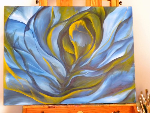
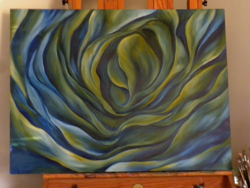
I have this big blue painting that has been sitting next to my easel for months. I was hesitant to move forward on it because something felt imbalanced about the composition. I had intended for this painting to be a meditation on rippling, folding matter, a sort of undulating consideration of this idea from physics that everything is made of something, and there’s no such thing as nothingness, as even space has certain properties and forces to it. Less abstractly, when you look at a flower and see shadows, you’re not seeing darkness or absence, but rather a part of the flower that is occluded, yet present. Each petal has both a top side and an underside, just as curves in nature have insides and outsides that are part of the same surface.
I wasn’t getting that feeling from this painting as it was, and I was frustrated that it felt like a bunch of impulsive decisions, without the organizing principles I’d intended.
It’s always with some trepidation that one revises a composition, but I knew I wouldn’t be happy with my first stab at this painting, in light of how easy it should be to change.
Using cadmium yellow and darker blue, I started essentially correcting the areas that stuck out to me. I thought more about the central idea, that everything comes from something, in terms of existence, spirituality, matter, physics, math, psychology, and on and on, thinking through what movements of this form could evoke these sensations. I knew I wanted the form to be more centralized and inwardly-focused, rather than jutting off the edges haphazardly as it had done.
It’s not accidental that the painting started looking more and more like a greenish-colored rose, as I’ve always used roses as a sort of shorthand for postmodern introspection and layers of meaning folding out from themselves. My undergraduate thesis project used details of roses and other organic forms to get at some of these same ideas, so I shouldn’t be surprised to come full circle and use them again, with different inflection. I think of dimensions as petals, so a treatment of some unfolding facets of existence logically follows blossoming flowers and wave forms.
I don’t know if I’m done revising this painting’s composition yet, though I’ve lived with it for a while and find I am mostly satisfied that I can work with this iteration, with small adjustments that will be sorted out while painting. It’s fun to consider an object in flux, wobbling toward what it will become.
I’m planning for the color to shift toward teal, with creamy highlights that pick up the yellow, and deep blues and browns that push the depths into sharper, clearer contrast.
I’m excited about what this painting could become, and I’m both relieved and encouraged by the revisions I’ve made. I haven’t typically kept track of revisions in the past, as I think there exists the risk that previous versions looked better and I’ll be able to see the ways I’ve ruined something good. I think the value of discovery from change is worth the potential ego pitfalls, and I must learn not to regret the changes that insist on being made.


