Mutability and Revision

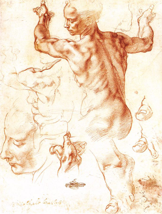
The more I draw, the more I learn about painting. That statement is both blindingly obvious and paradoxically elusive for me. I am about to finish my current sketchbook (so expect to see more drawings soon), and through it, I’ve learned incredible amounts about structuring a painting and attaching ideas to forms.

One aspect of oil painting that I’ve been reluctant to embrace is its infinite mutability. I used to resist making any changes to paintings, preferring to map out a composition at the inception and more or less stick with it to the end. More often, I would discover a compositional fault that I couldn’t get past and abandon the painting entirely, intending eventually to get back to it, but almost never doing so.

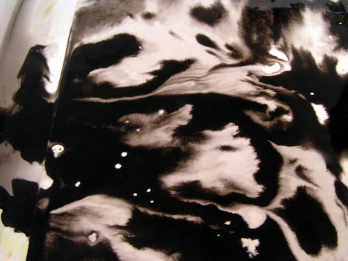
Grad school was very useful for loosening up my resistance to make changes, as in-progress critiques helped me identify the parts of compositions that were resolving problematically for viewers or in some other way failing to provide the appropriate structure for the ideas I was trying to layer onto images. Unfortunately, however, it also let me find a way to avoid having to make changes, as I moved into water media and embraced the unpredictable, fluid shapes formed by water in my ink paintings.

Now I’m trying to use what I’ve learned about structure from drawing to enact greater control over my oil paintings. I have a tendency to sketch out a vague form using washy lines, then plunge right into modeling curves and shapes without stepping back to consider the overall composition, scale, or bigger movements of the canvas until it’s too late. More importantly, I need to ask myself if what I’m painting actually matches what I’m thinking about, or if instead I’m getting lost in some lovely swoops that will ultimately feel shallow or frustrating to me.

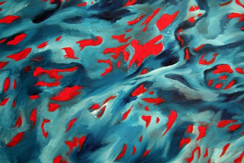
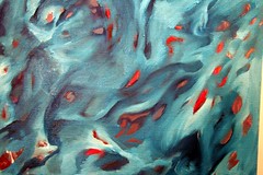
I have this big blue painting that has been sitting next to my easel for months. I was hesitant to move forward on it because something felt imbalanced about the composition. I had intended for this painting to be a meditation on rippling, folding matter, a sort of undulating consideration of this idea from physics that everything is made of something, and there’s no such thing as nothingness, as even space has certain properties and forces to it. Less abstractly, when you look at a flower and see shadows, you’re not seeing darkness or absence, but rather a part of the flower that is occluded, yet present. Each petal has both a top side and an underside, just as curves in nature have insides and outsides that are part of the same surface.

I wasn’t getting that feeling from this painting as it was, and I was frustrated that it felt like a bunch of impulsive decisions, without the organizing principles I’d intended.

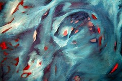
It’s always with some trepidation that one revises a composition, but I knew I wouldn’t be happy with my first stab at this painting, in light of how easy it should be to change.

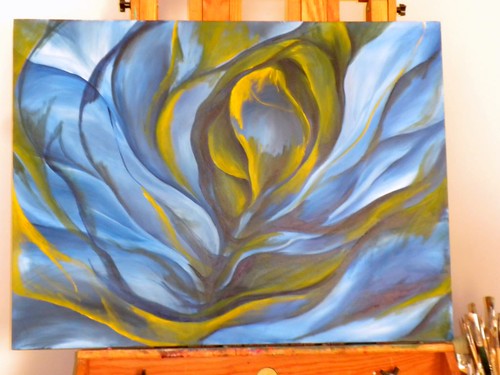
Using cadmium yellow and darker blue, I started essentially correcting the areas that stuck out to me. I thought more about the central idea, that everything comes from something, in terms of existence, spirituality, matter, physics, math, psychology, and on and on, thinking through what movements of this form could evoke these sensations. I knew I wanted the form to be more centralized and inwardly-focused, rather than jutting off the edges haphazardly as it had done.

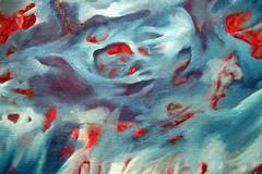
It’s not accidental that the painting started looking more and more like a greenish-colored rose, as I’ve always used roses as a sort of shorthand for postmodern introspection and layers of meaning folding out from themselves. My undergraduate thesis project used details of roses and other organic forms to get at some of these same ideas, so I shouldn’t be surprised to come full circle and use them again, with different inflection. I think of dimensions as petals, so a treatment of some unfolding facets of existence logically follows blossoming flowers and wave forms.

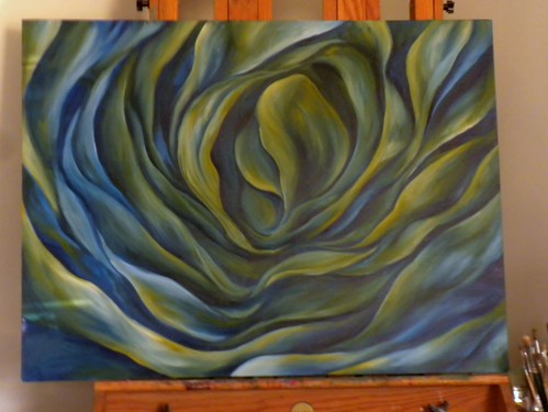
I don’t know if I’m done revising this painting’s composition yet, though I’ve lived with it for a while and find I am mostly satisfied that I can work with this iteration, with small adjustments that will be sorted out while painting. It’s fun to consider an object in flux, wobbling toward what it will become.

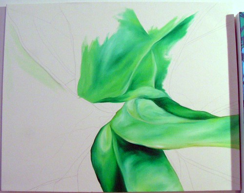
I’m planning for the color to shift toward teal, with creamy highlights that pick up the yellow, and deep blues and browns that push the depths into sharper, clearer contrast.

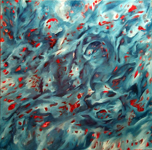
I’m excited about what this painting could become, and I’m both relieved and encouraged by the revisions I’ve made. I haven’t typically kept track of revisions in the past, as I think there exists the risk that previous versions looked better and I’ll be able to see the ways I’ve ruined something good. I think the value of discovery from change is worth the potential ego pitfalls, and I must learn not to regret the changes that insist on being made.


Some Thoughts On Drawing

Drawing, by its very nature, is an act of faith. A drawing is a unique creature that must continually ask of its creator the indulgence to persevere and persist in believing that its fulfillment is worthwhile. The finished drawing is rarely the finished product; rather, it serves as the documentation of a journey taken in the mind and sensibility of the artist, a crude adventurer’s map charted in the moments of discovery.

At their most accessible, drawings give the viewer access to the course of exploration between the chasm of the blank page and the landscape of lines or scumbled charcoal smudges that comprise an image. Other drawings are more akin to Coleridge’s vision of Kubla Kahn: fleeting, spectacular glimpses into a fantastic surreality that only exists instantaneously in the imagination. Both types have equal potential to become utterly captivating and decadently entrancing.

Academically-trained artists begin with drawing as the first – and primary – discipline because it allows for the most direct connection between materials and self. Drawing is the physical manifestation of the Cartesian self, declaring with each contour and gradient of tone, “I am, I am.”

More than words, drawing represents man’s fundamental split between being of the world and inhabiting a sentient mind. From the earliest marks scratched in sand or painted on cave walls, man has used drawing to mark the separation of inner subjectivity and physical experience, an interface that allows us passage between the two. The calligraphic emergence of writing cannot be coincidental to man’s ability, through drawing, to reflect upon and express what it is, and eventually what it means, to be alive.


Michelangelo Buonarotti. Study for the Libyan Sibyl, 1511CE, chalk on paper, 290x210mm, Metropolitan Museum of Art, New York.

In its economy of language, drawing retains an immediacy and, if deployed effectively, urgency of communication. Through drawing it is possible to see the essence of an idea, the core components that convey meaning. At times this meaning may not even be fully understood by the artist, who acts by a creative compulsion, yet demonstrates through drawing’s liminal qualities what the Romantic writers called the interior of the heart. One cannot view Michelangelo’s careful, sprezzatura cross-hatching without understanding his singular, industrious focus, nor the meditative, repetitive iterations of figures drawn obsessively in later life without recognizing they are an ephemeral treatise on mortality. In Michelangelo’s marks, a fervor most similar to spiritual devotion becomes apparent, with drawing serving as a visible prayer or incantation. It is also clear that Michelangelo’s faith was not misplaced in drawing.


Michelangelo Buonarotti. Christ Crucified between the Virgin and Nicodemus, c. 1552-54, black chalk, brown wash and white lead on paper, 433x290cm, Musée du Louvre, Paris.

It can be an enormous challenge to face the vast expanse and sucking void of the unmarked page, and by extension, the sprawling complexities of existence. Art students like to use the shorthand of horror vacui, but it is a more nuanced and demanding task to place one’s trust in drawing. One satisfactory transaction in drawing does not in any way guarantee future success in using its delicate, tenuous devices to hammer down meaning. An artist must continually face the uncertainty of drawing as a sufficient language, spurned forward only by tenacious faith that the marks will coalesce into some visual signifier or ambient carrier of sensation.

In this way, though they are humble and easily discarded, drawings may represent some of the bravest, most ardent acts of man, embodiments of the purest kind of faith.


Ink painting

On Wednesday, I enjoyed an afternoon painting outside in the sun, in a makeshift garden studio. It was incredibly inspiring to sit out in the grass, shaping it to hold paper for these small ink paintings.

Ink painting in the grass

Ink painting in the grass

I preferred the finished look (and process) when the paper was thoroughly saturated, as it allowed for more dramatic movements of the ink and water.

I made nine small paintings, eight on off-white 8″x10″ drawing paper and the first on 9″x12″ smooth Bristol. I preferred the absorbancy of the drawing paper, as well as the warmth of the resulting black and gray tones.

I’ve numbered these in the order I made them, in advance of titles.

1 - 9x12 on smooth Bristol

1 - 9"x12" on smooth Bristol

detail of 1, left side

detail of 1, left side

I saw the bubble kind of shapes in the first one and started making little circles. I tend to make patterns like this when I am doodling with a pen. In this case, I used a paintbrush to draw the circles with water, then touched a dropper of ink to fill the shapes, which was great fun to watch.

2 - 8x10 sumi ink on paper

2 - 8"x10" sumi ink on paper

detail of 2, center

detail of 2, center

I started to work in a butcher’s tray so I could saturate the paper with water. The large circular areas are where I dropped ink with a dropper, and the turbulence between occurs when the ink pushes water into adjacent flows.

3 - 8x10 sumi ink on paper

3 - 8"x10" sumi ink on paper

The shapes in this one reminded me of soap bubbles.

detail of 3, upper left corner

detail of 3, upper left corner

detail of 3, lower left corner

detail of 3, lower left corner

This fourth painting was wetter, so it made more rewarding flows of water with lighter grays. The wind blew a few times and flipped the paper over, making the drip-like marks that emerge from the center channel. I like the two drips at right, but the one going to the upper left bothers me.

4 - 8x10 sumi ink on paper

4 - 8"x10" sumi ink on paper

detail of 4, center

detail of 4, center

(The color on these photographs is inconsistent, but these drawings are all on the same off-white paper – I think my camera meters differently when there are richer blacks, and I didn’t notice it to adjust it.)

This one was also very wet, with the paper thoroughly soaked in inky water before the drops were applied. I like the ink effects when the paper is wetter, but working outside, this one also got blown around, producing a dribbling line toward the right. I don’t hate it though.

5 - 8x10 sumi ink on paper

5 - 8"x10" sumi ink on paper

detail of 5, lower left

detail of 5, lower left

It is uncanny to me how closely the shapes made by the ink resemble the shapes I draw in oil paintings. Maybe it is something archetypal for me, that in every media I come up with these movements, but it’s interesting to see the tonality worked out naturally, by the flow of water, rather than when I am trying to create an illusion with modeling and shading.

I started to make smaller marks on wet paper, watching them spread. In this case I did sequences of 13 dots, with varying amounts of ink in the dropper.

6 - 8x10 sumi ink on paper

6 - 8"x10" sumi ink on paper

detail of 6, upper center

detail of 6, upper center

I used drier marks in this piece, gently touching the edges of the nearly-empty dropper in wet areas, letting the water have more of a say. I like when there are whiter and lighter areas to act in opposition to the heavy expanses of black space.

7 - 8x10 sumi ink on paper

7 - 8"x10" sumi ink on paper

detail of 7, center

detail of 7, center

I especially like the branching, fractal-like shapes that the water makes as it soaks into the paper. Tide marks, I guess.

These last two were probably my favorites of the day, as they were really soaking wet. I used the ink more like fields than drops, observing the movements it made in space. I think this made for more delicate shading and softer transitions in the grays.

8 - 8x10 sumi ink on paper

8 - 8"x10" sumi ink on paper

detail of 8, center right

detail of 8, center right

detail of 8, upper right

detail of 8, upper right

I took a lot of flack in graduate painting classes for attempting to make illusionistic images. I still am not ready to accept that this can’t be done in contemporary art, and I think it was a personal hang-up with my professors and classmates.

That said, it does make me rather happy that this kind of process results in the kinds of tonal shifts I would make were I attempting to draw an illusionistic abstract space. I think a lot about the mutability of form, shifting and changing, the surreality of physics and what really goes on in synapses, among molecules, with electrochemical impulses and so on. It strikes me as a fitting place to allow for some imagination, and to my eye, these images work like folding and collapsing dimensions or detail views of extraordinarily large and complex organic systems.

For this last painting, I soaked the paper, dipped one corner in inky water in a butcher tray, then dropped a large quantity of ink at the opposite corner. (You can see the set-up here.) This one most closely approximates the sense of tides advancing and receding.

9 - 8x10 sumi ink on paper

9 - 8"x10" sumi ink on paper

detail of 9, center

detail of 9, center

detail of 9, lower center

detail of 9, lower center

I really like the ghost-like white area in between the two darker forms. It flips back and forth between a sort of negative space or a positive, modeled form, depending on how I look at its edges. It reminds me that there is never really such a thing as empty space, in an image or in reality, and I enjoy imagining what fills the spaces that appear empty from afar.

For an afternoon’s work, I’m pretty happy. It’s wonderful to enjoy the painting process, and I actually came up with a lot of things worth thinking about. Any time I use ink, I learn more about its properties and tendencies, and I am positively mesmerized by all the strange and lovely things the water does.

I like these little paintings as images themselves – to me, the black and white really fits the feeling in them and makes for a very satisfying experience. Because these are the types of movements and tonal shifts I’ve been searching for in oil painting, I may do some studies using these as reference, trying to capture some of the lush movements and elegant shapes.

I can’t wait to get out in the garden some more!


Habit-forming

I meant to use this blog as a studio journal, but I have still kept my notes on scraps of paper or jotted the occasional thoughts on painting in my regular blog. I don’t realize right away that I’m thinking about painting, especially because so much of the way I work is rooted in the way I live, but I would like to get more of that put down, made into images, and worked through.

Since February, I’ve been incredibly busy with school and work, I spent three weeks in Italy, and I’ve had a whirlwind of activity in my life. I have not, unfortunately, done much painting.

I think if I want to cultivate a more regular studio habit, I need to pay more attention to thoughts and observations as they come, without worrying about the way they reflect on me. Self-consciousness has had enormous inhibitory effects in my life lately.

I am still slowly plugging away at the red and blue painting. I went over the red areas with an opaque cadmium red, making them solid shapes instead of a modeled background layer. I was attempting to make it a unified plane, against which the blue forms would push and pull, playing with the color relationships. It’s fun to invert the receding movements with value changes and fight against the natural inclinations of colors, though I’m sure this game has been played many times before.

I’ve been finding enormous inspiration in plants, flowers, water, and nature, now that I’m living at the shore again. I wonder if the synthetic feel that my painting took on at Pratt was to do with imagination-fueled inspiration that wasn’t grounded in the observable world. It felt like virtual painting, a computerized pastiche, rather than dreaming in nature’s presence. Neither approach is better or worse than another, but I find I’m much happier when I feel viscerally moved to paint by all the things I see and experience.

I have some literal and figurative housekeeping to do with my paintings and the huge pile of works in progress. It feels silly to keep starting new paintings when I have so many ideas I still want to work through in their incipient phases, but at the same time, I keep stepping in this river a different person, and I want to start with a new feel, new colors, new strategies and so on to reflect that. The solution, I suspect, is to get better at finishing what I started, or to accept that when I’ve let something fizzle out, it was probably for a good reason.


The colors where we’re home

This week I was talking with a friend about colors. He works with computers, and he described the way he color-codes the backgrounds of different terminals so he always knows where he is. The green ones are his “home,” where he feels free and safe, like he’s returned to where he belongs.

I have been thinking about this a lot since then, the meanings that colors carry, and especially this sense of belonging and feeling at home. Not surprisingly, it worked its way into my painting.

24"x24" oil on canvas, in progress

I had started then abandoned this canvas almost two years ago. It’s always carried a nice energy for me, so I enjoy starting it up again.

Something I’m finding interesting about the way the colors are working now is the tendency for blues to recede and reds to come forward. It’s a kind of push/pull which I’m playing against with illusionistic shading in the blue areas.

detail view

There is a murky grayish purple color behind the transparent phthalo turquoise that keeps sneaking into it. I’m not sure it bothers me, but I’m very aware of it.

detail view

detail view

The movements are pretty satisfying, though the scale is perhaps a bit tight in places.

detail view

detail view

I’m looking forward to working on this piece more. It has a lot of really comfortable feelings and associations in it. I realize that a lot of my process involves the people I am thinking about and the music I am listening to while I paint. This one has some great stuff in both respects.